103 Soundsystem
Christchurch, New Zealand
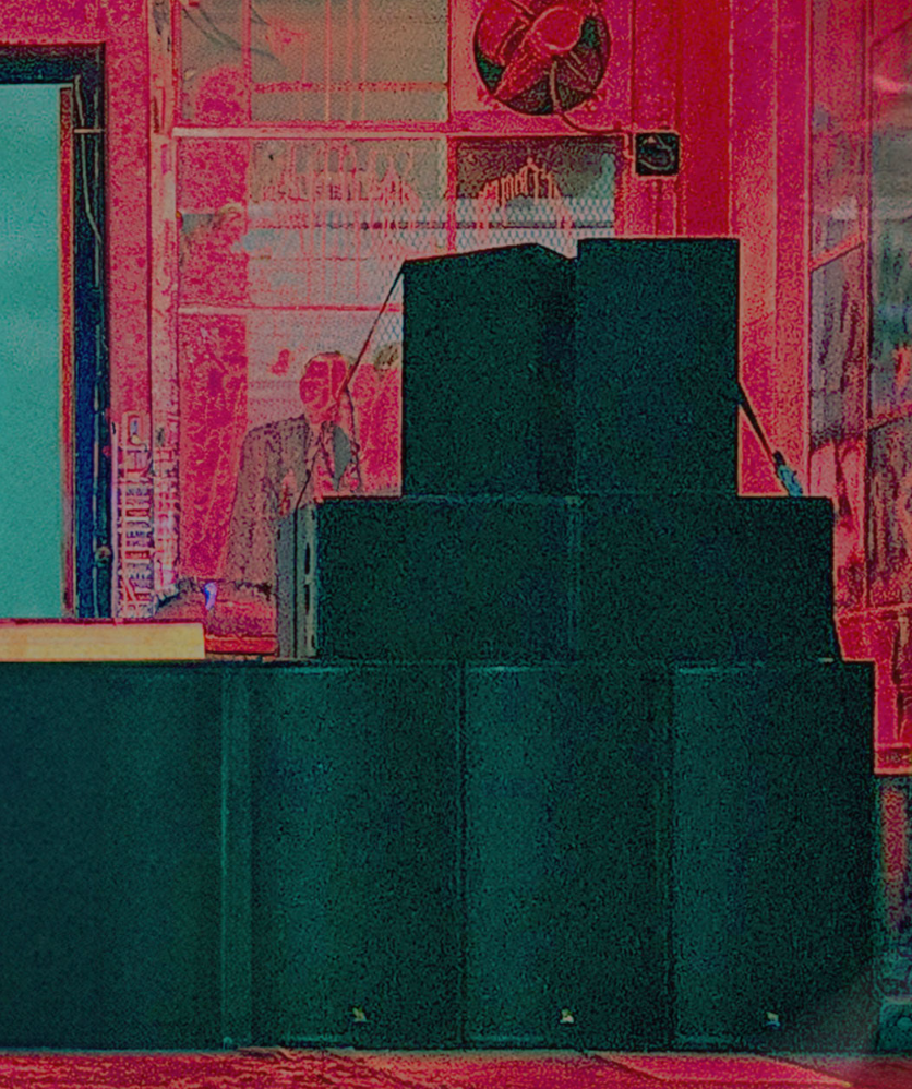
Establishing a new brand in an existing market is always tricky. 103 Soundsystem was in that exact situation. As a sound equipment hire company based in Christchurch, they were looking to set themselves up as dependable and confident for their customers. Centrally, they were needing an identifiable logo, sure to look clean on posters and gear, alongside a complete package of social media materials.
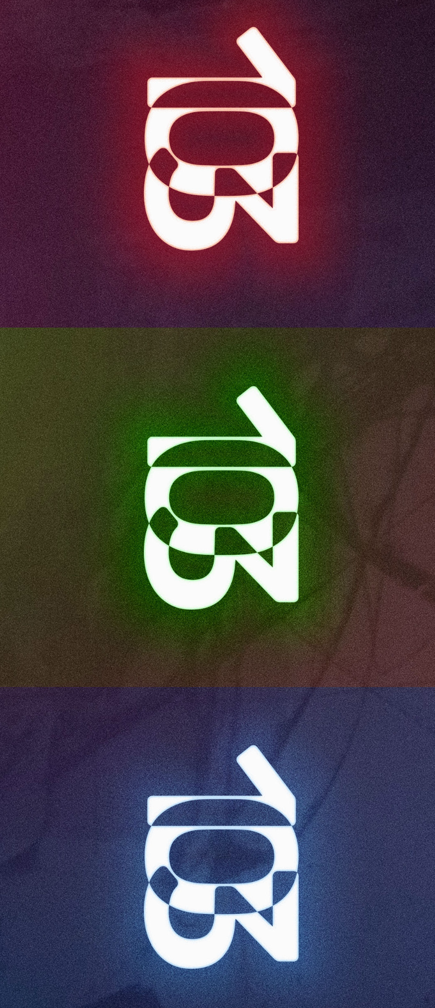
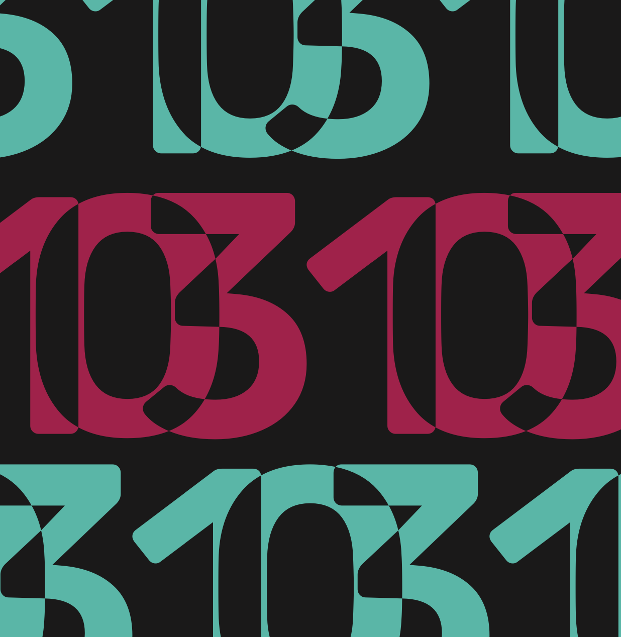
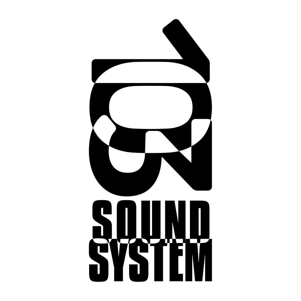
Typography has always been an integral part of branding in the music industry, and especially across band posters. The 103 branding we see here continues this tradition with its main form being made of text. For a source of inspiration, we looked through the music industry, zeroing in on grunge band posters of the ‘90s as a base for the brand’s aesthetic language. Text holds the power to evoke emotions through the shape of letters and words. In an industry where emotion and expression reign supreme, the right typography can amplify a brand's voice in unprecedented ways.
"zeroing in on grunge band posters of the ‘90s "
In the early days of gig posters, images were far too costly to print, so text dominated the space. Posters being made completely of text make the font incredibly important. Art has always been driven by necessity and these early posters drove their art into clubs and venues across the world. The 103 logo is a continuation of this tradition. Text first, in black and white. Bold with simple lines and an emphasis on negative space evoke this classic style.
contact us

Working with us isn’t complicated, just give us a call or flick us an email and we can get started.
Phone: +64 021 837 132