Canterbury's Choice
Canterbury, New Zealand
Amidst a sea of choices clamouring for attention on store shelves, the strategic use of colour emerged as a crucial factor in brand differentiation. A clear opportunity arose: simplicity and colour would set the brand apart in a landscape dominated by loud, complex designs.
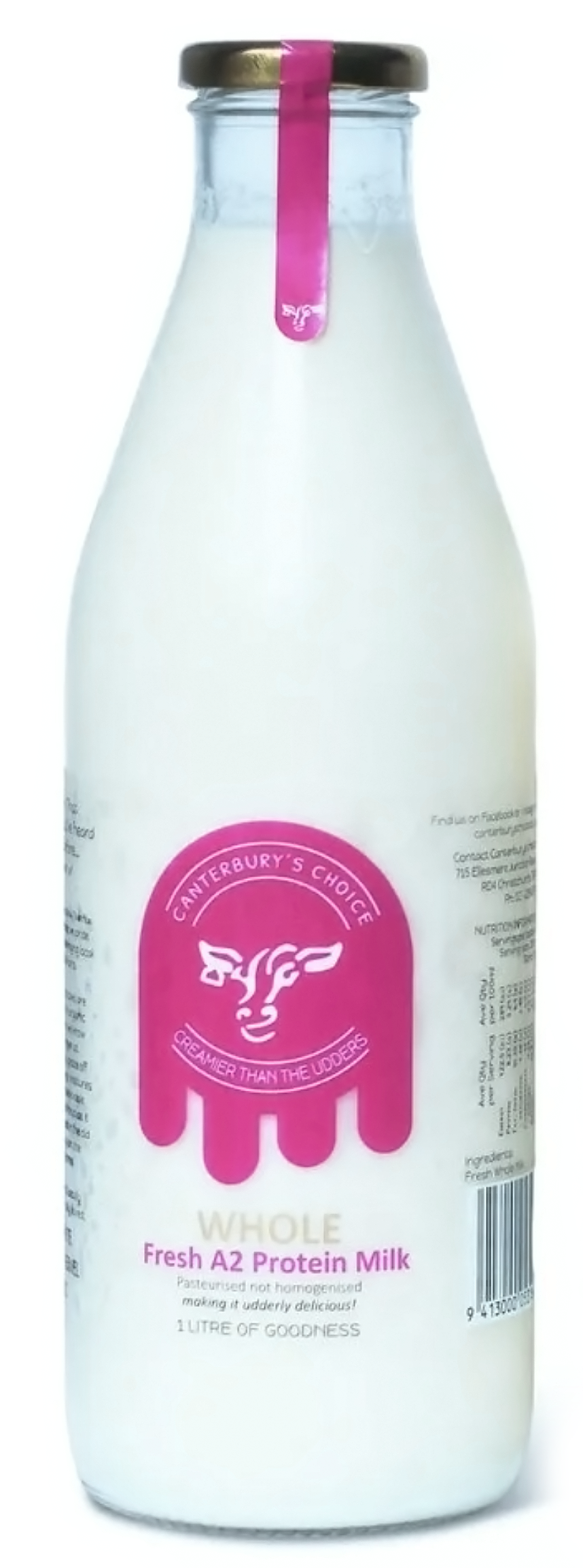

Canterbury’s Choice is a boutique Mid-Canterbury independent milk distributor so standing out against the major players was a central factor in this design.
"the strategic use of color
becomes an indispensable tool
in distinguishing a brand "
A pink logo against white milk showcased in a clear glass bottle created a visually striking effect, instantly drawing consumers' attention. This packaging choice not only highlighted the product's purity and simplicity but also established the brand's visual identity. The transparent bottle allowed the natural colour of the milk to complement the pink logo.
contact us

Working with us isn’t complicated, just give us a call or flick us an email and we can get started.
Phone: +64 021 837 132